Course 8
Ecommerce website design
How to improve your website for maximum sales
An ecommerce website should be designed specifically for online consumers. This means, focusing on what online consumers need from a website to make it more convenient for them to browse and purchase.
Factors to consider:
- Who is the target audience?
- What do they need to do on the website?
- What will make it easy for them to do this?
- How can the customer journey be simplified?
- How can purchasing be as easy as possible?
Website user experience
Adjusting your website design to be more comfortable and convenient for your target audience is called improving the user experience (UX). It refers to the interaction a customer has with your brand and website.
Best practices for UX:
- Simplicity works best as customers want information and products quickly without being distracted.
- Include a navigation bar so website visitors can easily find what they need.
- Don't clutter your website with too much text (website visitors usually skim-read).
- Don't clutter your menus with too many options.
- The website should load almost immediately to prevent visitors from leaving in frustration.
- Design your website around the customer and how they will use your ecommerce store (less talking about the company and more function for the user).
Further reading: How to provide a personalised customer experience in ecommerce
Website speed
According to Google and SOASTA Research in 2017, as many as 32% of online visitors will leave your website if it takes more than 3 seconds to load. Check your website speed for free using one of these tools:
Further reading: 5 ways to improve a bad bounce rate for ecommerce websites
Creating a home page that converts
The home page of a website gives you a few seconds to impress online users. It's a chance to make it clear what you sell and why they should choose you over your competitors. If your home page is interesting to online users, they are more likely to stay, browse, and make a purchase.
1. Start with an eye-catching headline
This could be an introductory offer, a seasonal offer, or a summary of your services (or brand tagline) to draw online users in. It doesn't need to be directly at the top of the home page. It could be beneath your top menu and logo, but still "above the fold" (the top section of your web page before the user has to scroll down to see more). For example:
- 20% off your first order
- Black Friday deals
- Cyber Week deals
- The Christmas shop is open
- Your next adventure starts here (e.g. for cycling or camping gear)
- Toys for smart kids (e.g. for educational toys)
Don't forget to show a call-to-action (CTA) alongside your headline. These are buttons with a link to direct your customers to the relevant web page. For example:
- Shop now
- Browse deals
- Browse offers
- Shop offers
- See offers
- Shop gifts
Further reading: What are calls-to-action? Examples for ecommerce
2. Organise your main menu
Your main menu is a powerful tool for your website visitors. If it's badly organised, you can lose potential customers. Organise your products into their categories and sub-categories. Then display the main categories in the main menu.
These are the primary pages to include in your main menu:
- About
- Contact
- Products (split into their relevant subcategories)
You can look at your competitors to get an idea of how they have categorised their products and grouped them for the menu and sub-menus. Don't be worried if you have a lot of items in your main menu. If it helps customers to navigate their way around your website to find what they need, then it's good for UX.
Further reading: How to create the perfect about us page (that makes money)
3. Create a footer menu
The footer menu isn't very exciting but it's necessary. It includes legal information and easy access to common requests such as returns, shipping, and FAQ details. As an example, your footer can have links to these web pages:
- Privacy policy
- Terms and conditions
- Returns
- Delivery information
- Help (or FAQs)
4. Show your products
Once your customer can see above the fold what your website is about, they will be eager to see the products you sell. It's convenient to display these beneath the main menu and promotional banners.
As the customer scrolls down they will expect to see some products without needing to go through to another page. This helps them to decide if they are interested or not, and whether to stay and browse more.
Since you will be showing a small selection of your product catalogue, you might like to split them into groups. For example, a pet shop might show a section with cat products, dog products, fish products, and reptile products.
Informative product pages
Product pages are a key selling tool. This is where you will be able to entice your customers into making a purchase. These are some useful tips.
Do:
- Include relevant product details such as colour, number of items if it's a set, dimensions, brand, and weight.
- Display the key features and benefits of each product.
- Keep the copy short, useful, and easy to understand.
- Use high resolution images of your products from different angles so the customer has a good idea of what they are purchasing.
Don't:
- Forgo writing about the features and benefits. This is crucial for painting a picture for the customer to show them how they must buy this fantastic product. It's also great for SEO if you include keywords.
- Hit the customer with an essay about each product.
- Forget to tempt customers with other products at the bottom of the product page e.g. "Similar items you may like" or "Customers also purchased." These encourage customers to stay and browse your dropshipping store.
How to plan your website design
Now that you have an idea about some of the content, it's time to plan the design and layout of your website. If you prefer to jump in the deep end, it might work for you to just get started and make adjustments as you go. This is easy to do when you are creating a website with a website builder or content management system.
However, if you prefer to plan first, here are some options.
Wireframes
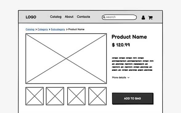
Wireframes are sketches of your website pages. They can be drawn with pencil and paper or digital drawing software. Website designers use these when pitching their ideas to clients and to help them visualise how they will build each page.
Drawing wireframes is quite quick and can save time by avoiding mistakes you might make if you jump in and start without a plan. It's also a great way to think about the layout without worrying about the content details such as photos, videos, colours, branding, and copy.
How to use wireframes:
- Use boxes to represent images
- Use lines to represent text
- Use shapes and boxes to represent buttons
- Draw the basic outline of the main menu, text boxes, headers, footers, and search bar.
Site map
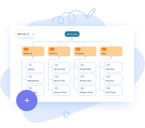
According to Google Search Central, a site map is an important map of your website. It is useful for users to navigate your website, especially if it has hundreds of pages. There are three types of sitemap:
- One for developers
- One for search engines
- One for human users
It visually displays how to get to each webpage from the main menu, header and footer links. A sitemap can also be used for planning the layout of a website. Draw a site map with digital drawing software, a spreadsheet, or a writing document.
Additional benefits of a sitemap:
- Generating a HTML or XML sitemap allows search engines to crawl your web pages easily and index your website (good for SEO)
- They are great for new websites that have few external links directing to it. Again, this helps search engines to rank your website.
- It is especially advantageous for websites that have over 500 pages.